Bloom
Bloom is a minimalist mental health companion designed to bridge the gap between "tracking data" and "understanding emotions. Unlike traditional mood trackers that feel like spreadsheets, Bloom uses a tactile, color-driven interface to make emotional reflection a seamless part of a user’s daily ritual.
- Lack of Context: Users see a "bad mood" on a chart but don't understand the triggers behind it.
- Clinical Feel: Cold, sterile interfaces can make users feel like "patients" rather than people seeking growth
Bloom is a comprehensive mobile companion for mental wellness. It solves the problem of disconnected self-care methods by centralizing:
- Mood Tracking: Daily check-ins to monitor emotional states (Muud).
- Journaling: Structured and free-form writing to process thoughts.
- Insights: Data visualization to identify triggers and patterns over time.
UX Design Strategy
Our goal was to simplify the start. I turned a difficult habit into something that takes almost no effort.
- Flow: I simplified the entry process. Checking in mood takes less than 10 seconds, encouraging daily consistency.
- Information Architecture: I prioritized the most frequent actions (Check-in, Journal) on the home screen while keeping deeper analytics accessible but not overwhelming.
UI Design Strategy
The UI strategy was to create a "A quiet, safe space on your phone". Every visual element was chosen to reduce stress.
- Soft Minimalism: We used large border radius (rounded corners) and generous white space.
- Tactile Feedback: I designed the UI to feel "physical".
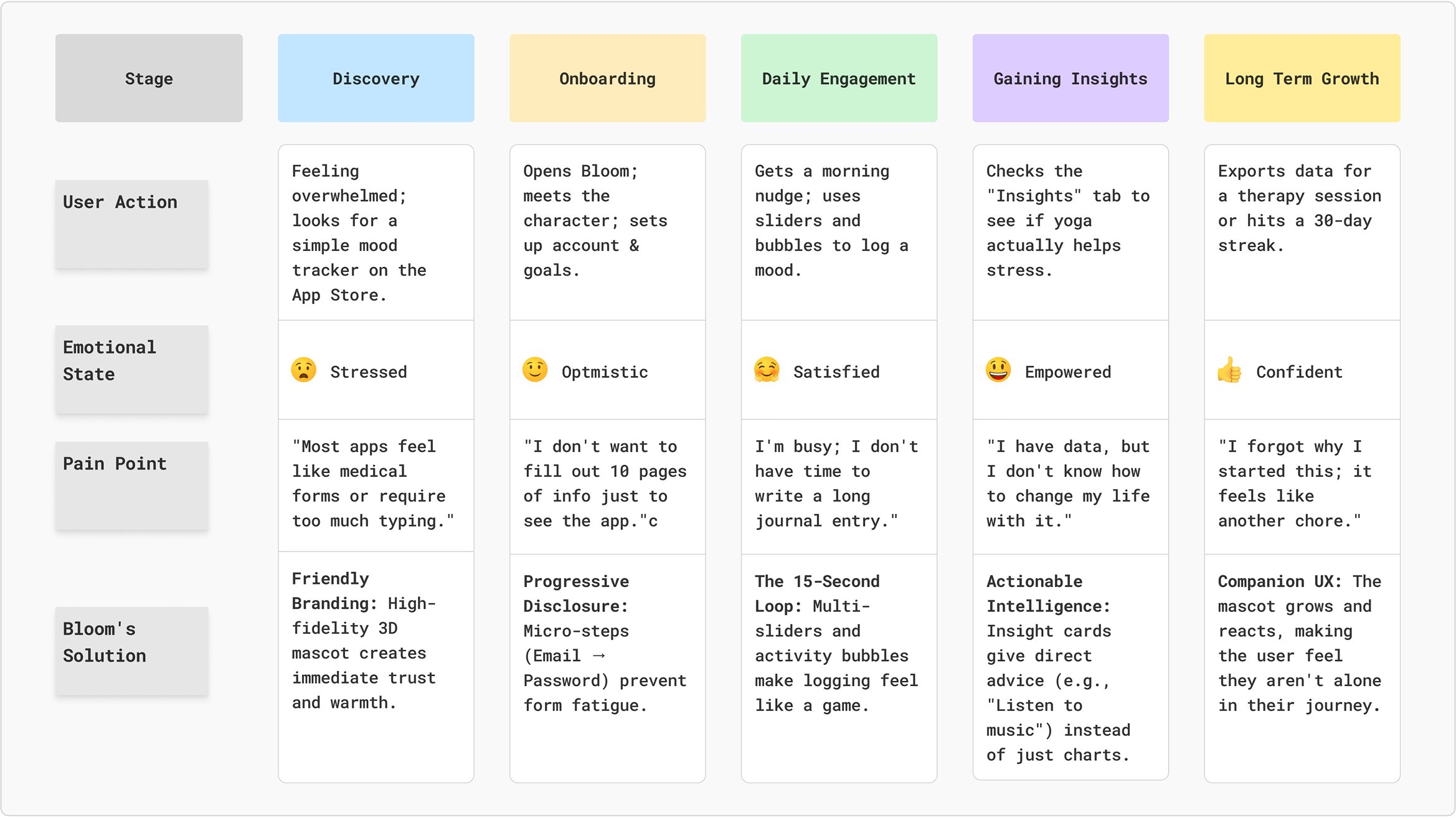
Customer Journey Map
Scenario: Sarah (27, Marketing Manager) feels overwhelmed by work stress and wants a quick way to track her mood and reflect on her day without adding to her mental load.
Competitors Analysis
UX Research Insights
- Making Habits Easy: Most people quit mood tracking because it feels like a chore. Bloom was designed to be finished in under 15 seconds so it’s easy to do every day without feeling like work;
- A Friend, Not a Tool: Many health apps feel cold, like a doctor's office. We used a 3D character that reacts to your mood to make the app feel like a supportive friend, which keeps users coming back;
- Freedom of actions: You are rarely just "happy" or "sad." Our sliders let you log mixed emotions – like feeling joyful but stressed at the same time – because that’s how real life actually works.
Competitors
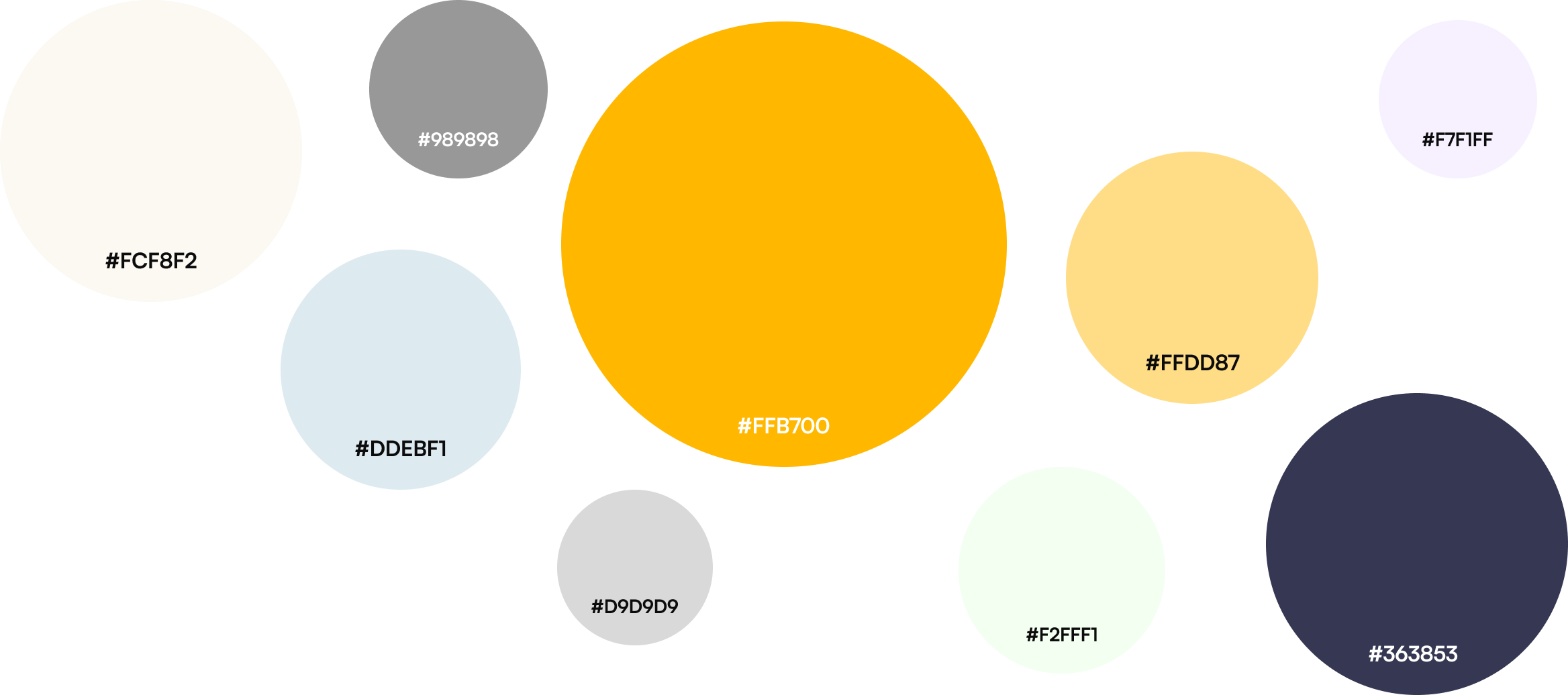
Colors
I chose these colors to create a warm, grounding atmosphere that feels more like a cozy paper journal than a cold screen. The soft cream and deep blue provide a calm, low-stress backdrop, while the golden amber adds a touch of optimism and focus.

- #FFB700
- #DDEBF1
- #989898
- #FFDD87
- #FFDD87
- #363853
- #D9D9D9
- #F2FFF1
- #F7F1FF
Font
I chose Satoshi because its clean, modern design makes the text very easy to read and keeps the interface looking organized. Its balanced style feels professional yet friendly, perfectly matching the app's calm and simple vibe.
Typeface: Satoshi
Category: sans
Screens & Flows
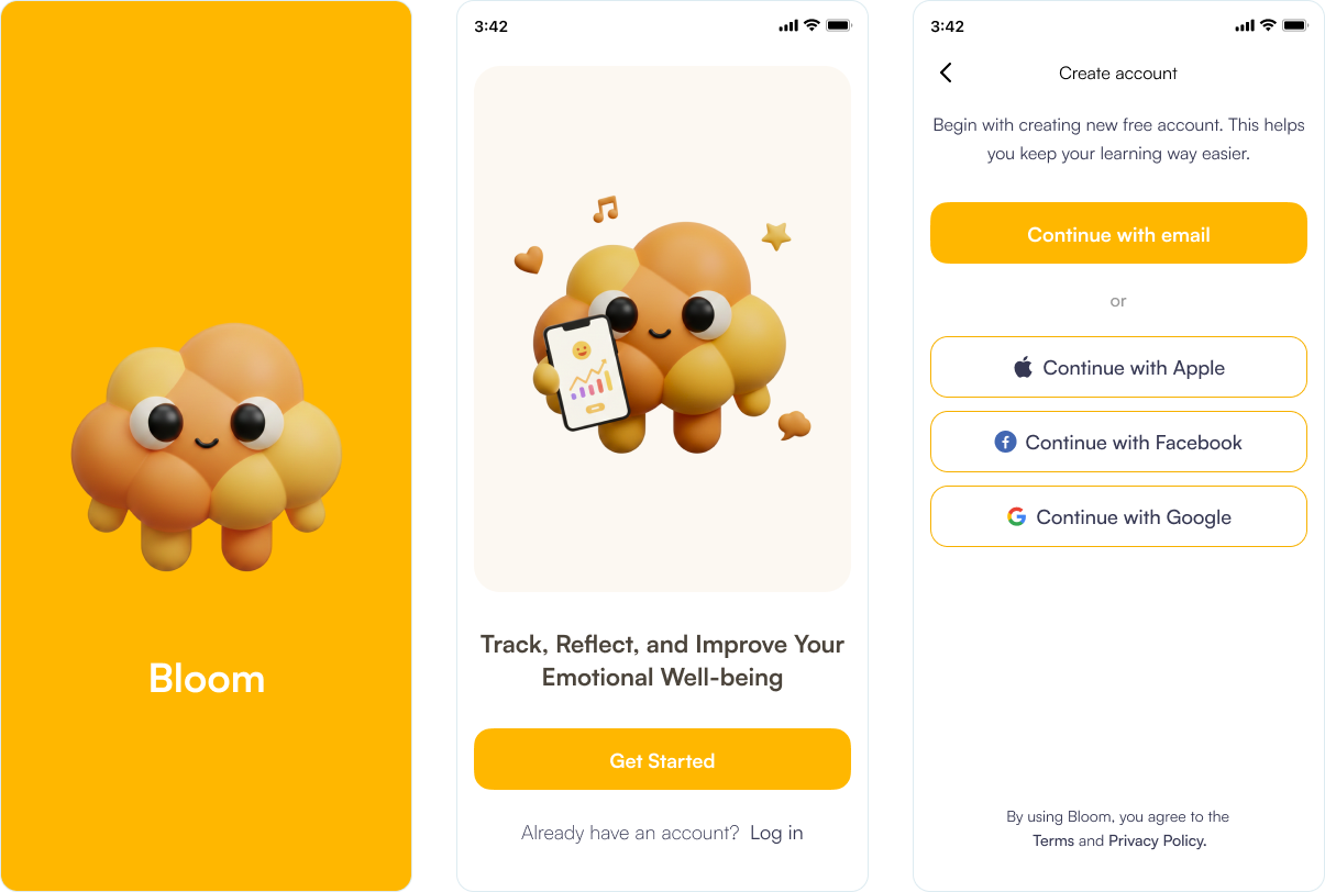
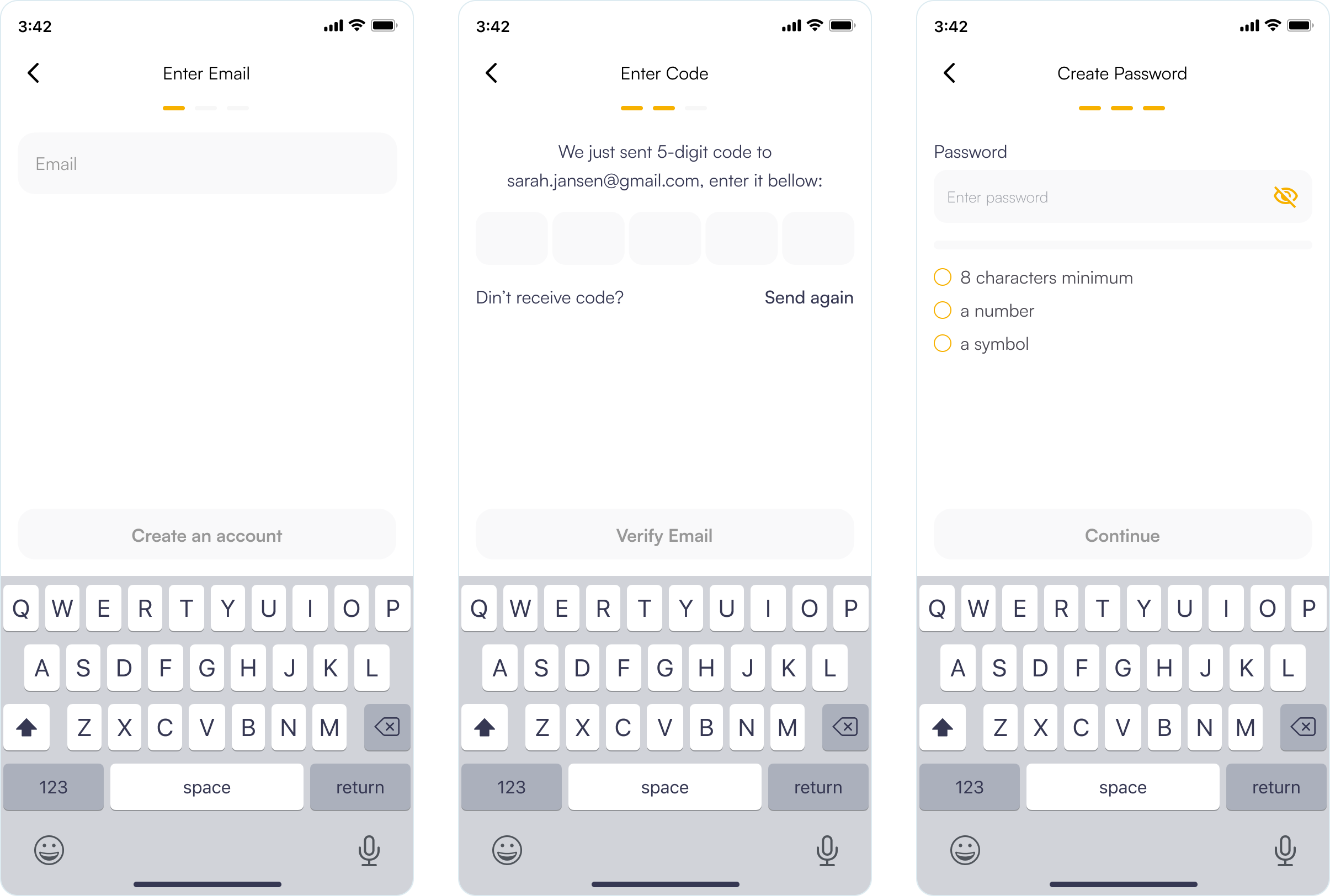
Splash, Sign Up & Onboarding
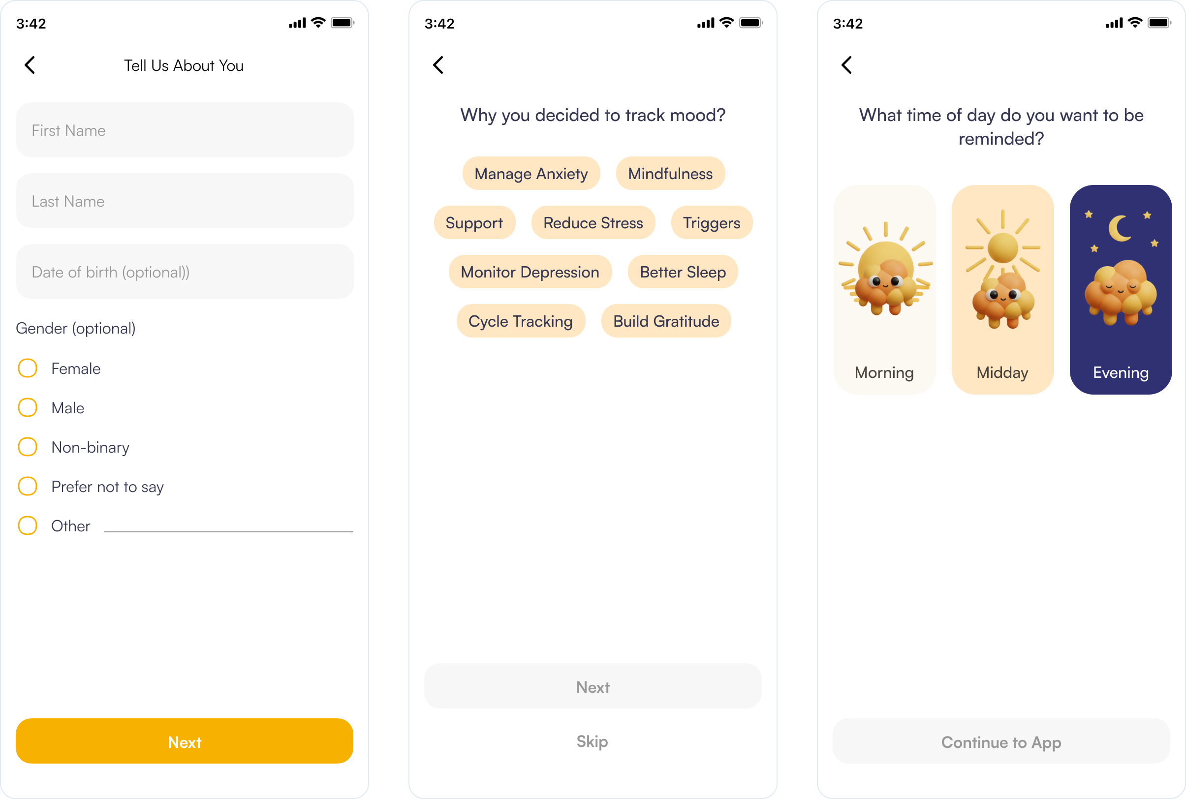
The Bloom onboarding flow utilizes a frictionless strategy, prioritizing social authentication to minimize the initial effort required from users. By implementing progressive disclosure, the registration process is divided into three manageable micro-steps to prevent users from feeling overwhelmed.
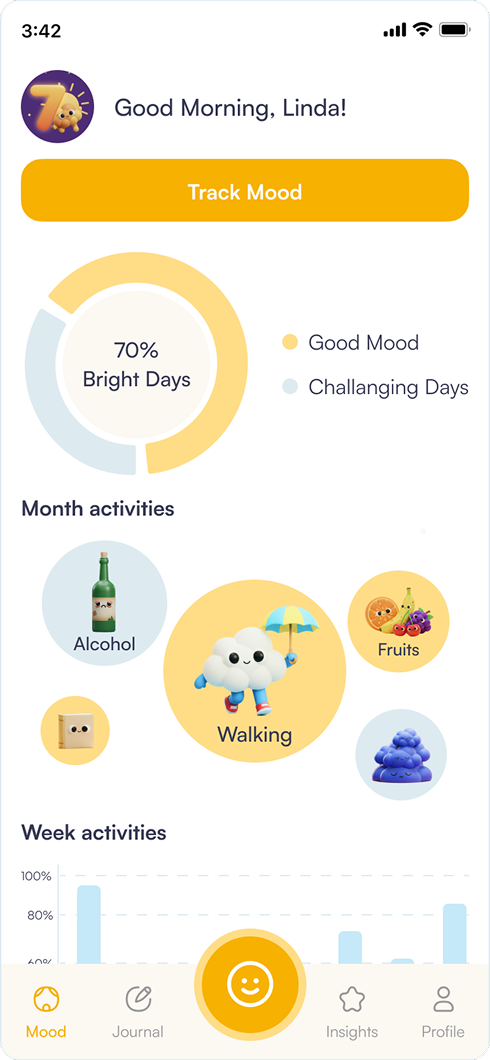
The Mood Dashboard serves as a "Calm Hub" designed for immediate emotional clarity and low-friction engagement.
- Glanceable Data: The central Mood Balance Ring provides an instant "Bright" vs. "Challenging" day ratio, offering high-level insights without complex analysis.
- Behavioral Correlation: By visualizing Month Activities as varied bubbles, the UX naturally nudges users to link their habits—like walking or diet- to their emotional trends.
- Reduced Self-Judgment: The use of empathetic language like "Challenging Days" instead of "Bad" creates a supportive environment that encourages honest tracking.
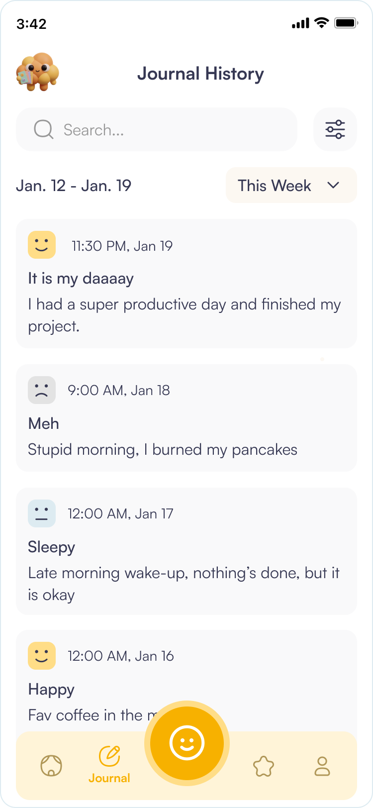
The History screen is a simple place to look back on past entries. It’s designed to help users quickly find specific days and easily see how their mood has changed over time.
- Search Functionality: A prominent, clean search bar at the top allows users to find specific memories or triggers instantly by keyword.
- Mood-Based Filtering: Users can filter their entire history by specific emotional states.
- UX Goal: This allows users to quickly find "Bright Days" for a mood boost or analyze "Challenging Days" to identify recurring negative patterns.
- Visual Hierarchy: Every entry is a clean card that summarizes your day.
- Immediate Context: You can see your mood, date, and notes all at once without clicking.
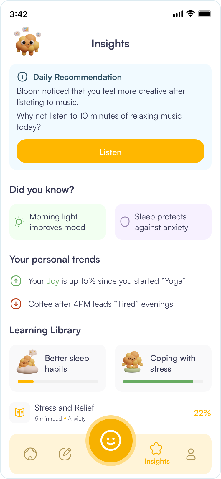
The Insights screen represents the "intelligence layer" of the Bloom app. The UX focus is on actionable data—transforming raw behavioral tracking into meaningful, easy-to-digest advice that helps users close the loop between reflection and improvement.
- Gamify Education: Using progress bars and "completed" states.
- Support the User: Providing value beyond just "tracking" by giving them the tools to improve.
- The Learning Library: This section introduces educational content tailored to the user’s current emotional state.
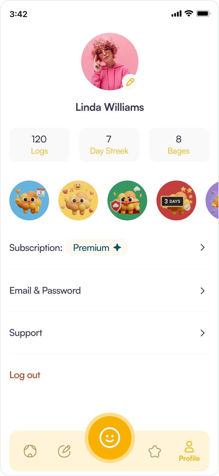
The Profile tab shows general user info and achievement badges. Users can see both their earned badges and the ones they haven't unlocked yet, which motivates them to keep tracking their mood.
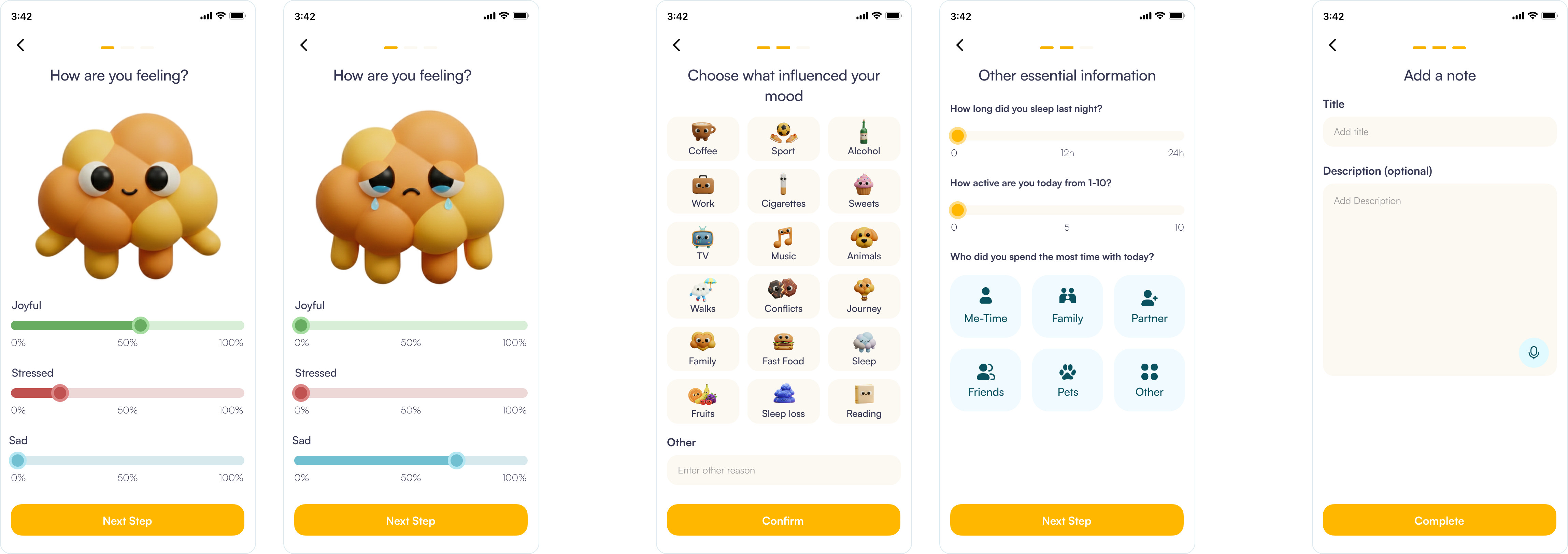
The Mood Tracking flow is designed to be the "heartbeat" of the Bloom app. The UX strategy focuses on emotional granularity and tactile engagement, moving away from simple "happy/sad" buttons to a more nuanced, multi-dimensional reflection.
- Visualizing Complex Emotions: Unlike traditional trackers that force a single mood choice, this interface uses multiple sliders for "Joyful," "Stressed," and "Sad."
- Dynamic Visual Feedback: A large, 3D character in the center reacts in real-time to the slider positions.
- Frictionless Contextual Identification: The "Choose what influenced your mood" screen uses a grid of large, tappable icons to identify external triggers without requiring manual typing.
- Visual Shorthand: Using recognizable icons (Coffee, Sport, Conflicts) reduces the cognitive load on the user, allowing them to complete the context-setting phase in seconds.
- Progressive Disclosure: The final step - adding a note - is presented only after the user has already engaged with the simpler, more visual steps.