Dostupno.UA is a prominent Ukrainian non-governmental organization (NGO) founded in 2015 by Dmytro Shchebetiuk. The organization is a leading voice in the movement for a barrier-free environment.
What they do:
They perform accessibility audits of cities and businesses, provide consultations for infrastructure projects, and run motivational campaigns for people with disabilities (including war veterans) to encourage an active social life.
The Problem
While the organization fights for physical accessibility, their digital presence needs to reflect those same values - offering an intuitive, and highly accessible experience for all users.
UX Goals (The "Why")
After reviewing the user experience, I found two big goals that our current layout makes too difficult to achieve.
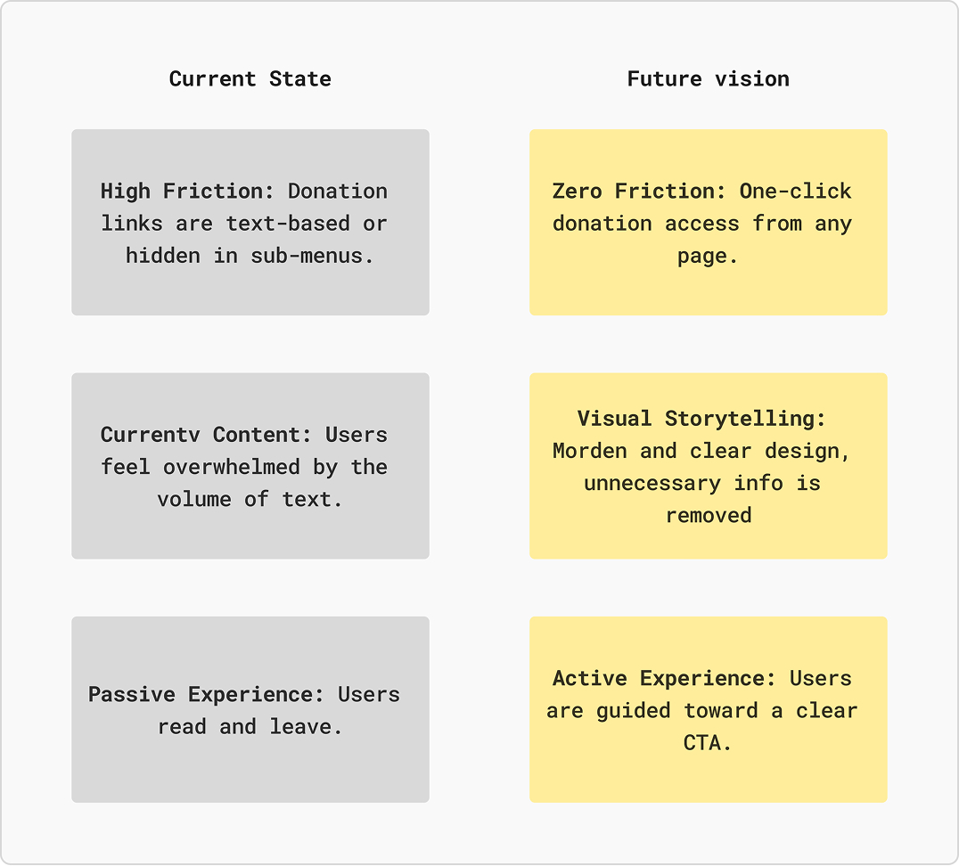
- Information Overload vs. Clarity
- The Problem: The website is crowded with old content and long paragraphs. This clutter makes it hard for users to understand what DostupnoUA does and why it matters.
- The UX Solution: Implement a Content Pruning strategy. By auditing and removing non-essential information, I made easier the user journey, allowing the most impactful stories and data to stand out.
- The "Donations" Flow
- The Problem: The site is so cluttered with old content and long paragraphs that it's overwhelming. This "noise" stops new visitors from seeing how they can actually get involved or support organization.
- The UX Solution: I redesign the site hierarchy to prioritize 'Support' as a primary action. This involves implementing a "sticky" donation header and an updated "Make a Donation" page and flow, where users can discover information and options to make a donation or become a volunteer.
Technical Audit: Current Performance Baseline
The website currently demonstrates strong technical health, scoring in the "Green" zone (90+) across all key web vitals:
- Accessibility (98/100): From a code perspective, the site is well-structured with proper labels and high color contrast.
- Performance (94/100): The site loads efficiently with a low Time to Interactive (TTI), meaning users aren't waiting long for the page to become functional.
- Best Practices (100/100): The site follows modern web security and code health standards.
- SEO (92/100): The platform is well-optimized for search engines to discover its content.
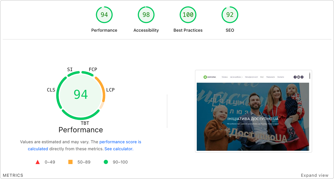
My redesign bridges the gap between a technically 'perfect' site and a functionally intuitive one. I am taking these strong technical foundations and applying UX improvements to solve the specific problems our users ran into.
The "Problem & Solution" Approach
Users who are motivated to support the movement for accessibility are often lost in a sea of unnecessary information, resulting in loosing the donation page.
Improvement Roadmap for Dostupno.UA
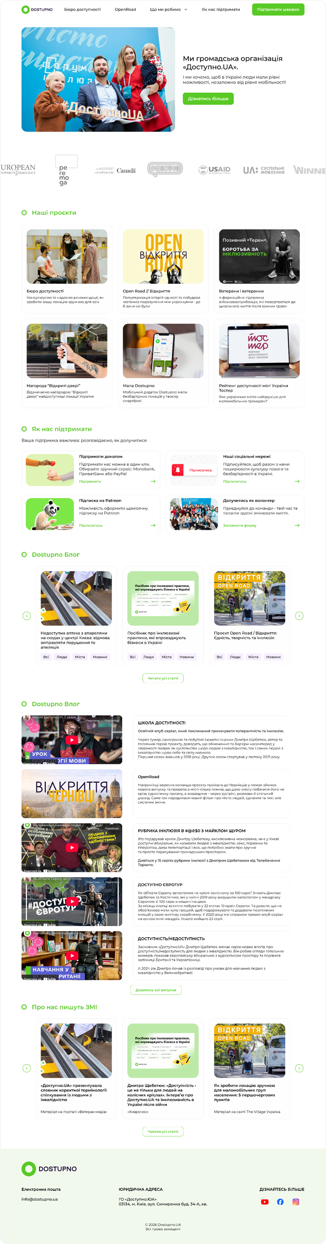
Home Page
UX Strategy & Optimization
- Information Architecture Refactoring: I restructured the complex content - into a clean, intuitive hierarchy. This ensures that users (veterans, business owners, and volunteers) can find relevant tools like the "Accessibility Bureau" .
- Conversion-Centric Support Flows: Recognizing that financial sustainability is key, I redesigned the "Support Us" section into high-conversion cards. By introducing a "Quick Support", I reduced friction, allowing users to choose between one-time donations (Mono, Privat, PayPal, Portmone) and recurring Patreon memberships with minimal cognitive load.
- Accessibility-First Navigation: Beyond standard WCAG compliance, I focused on "low-mobility UX." This included large tap targets, high-contrast readability, and a logical flow that mirrors the physical ease of navigation the organization advocates for in the real world.
- Engagement Loops: I implemented a "Share Your Story" feature, creating a user-generated content loop that increases time-on-site and provides authentic social proof for potential volunteers and donors.
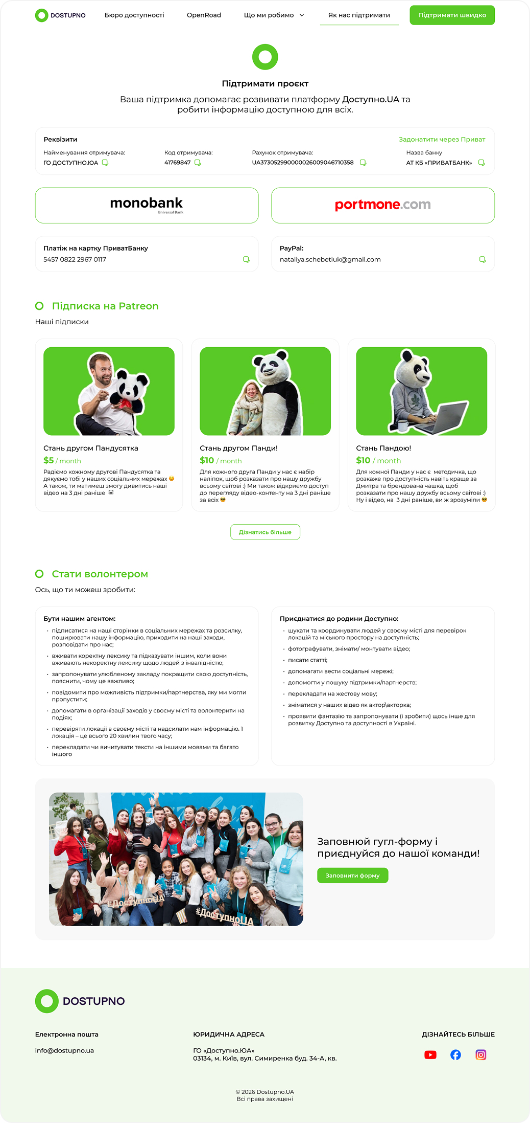
Support Us
UX Strategy & Optimization
- Frictionless Transaction Design: I replaced the traditional, overwhelming list of bank requisites with a "Quick-Tap" interface. By categorizing payment methods (Monobank, Portmone, PayPal, Privat24), I reduced the user's cognitive load and time-to-donation.
- Copy-to-Clipboard Integration: To solve the pain point of manual data entry, I added interactive "copy" icons next to card numbers and emails, ensuring 100% accuracy for mobile-first users.
- Tiered Subscription Model (Patreon): BI restructured the Patreon section into a tiered value proposition ("Panda's Friend" vs. "Become a Panda"). By visualizing these tiers with playful, relatable imagery, I shifted the user's perception from "giving money away" to "joining an exclusive community".
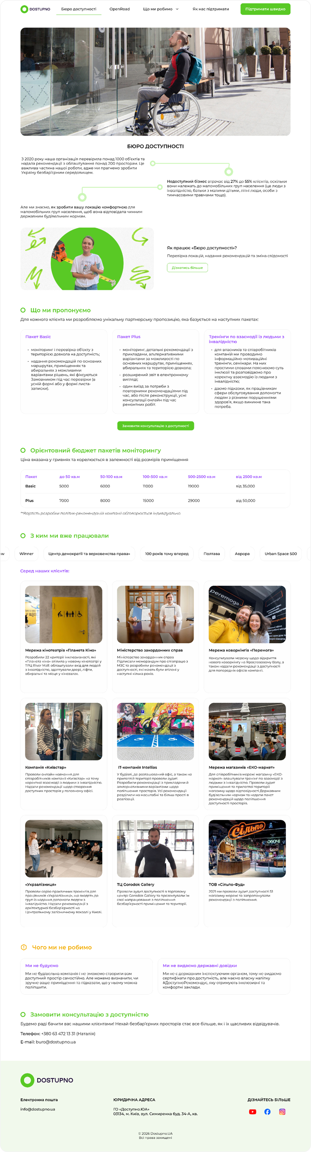
Accessibility Bureau
I structured the page to guide business owners through a logical funnel: identifying the problem, exploring specific solutions (Audits, Consultations, Training), and viewing proven success stories.
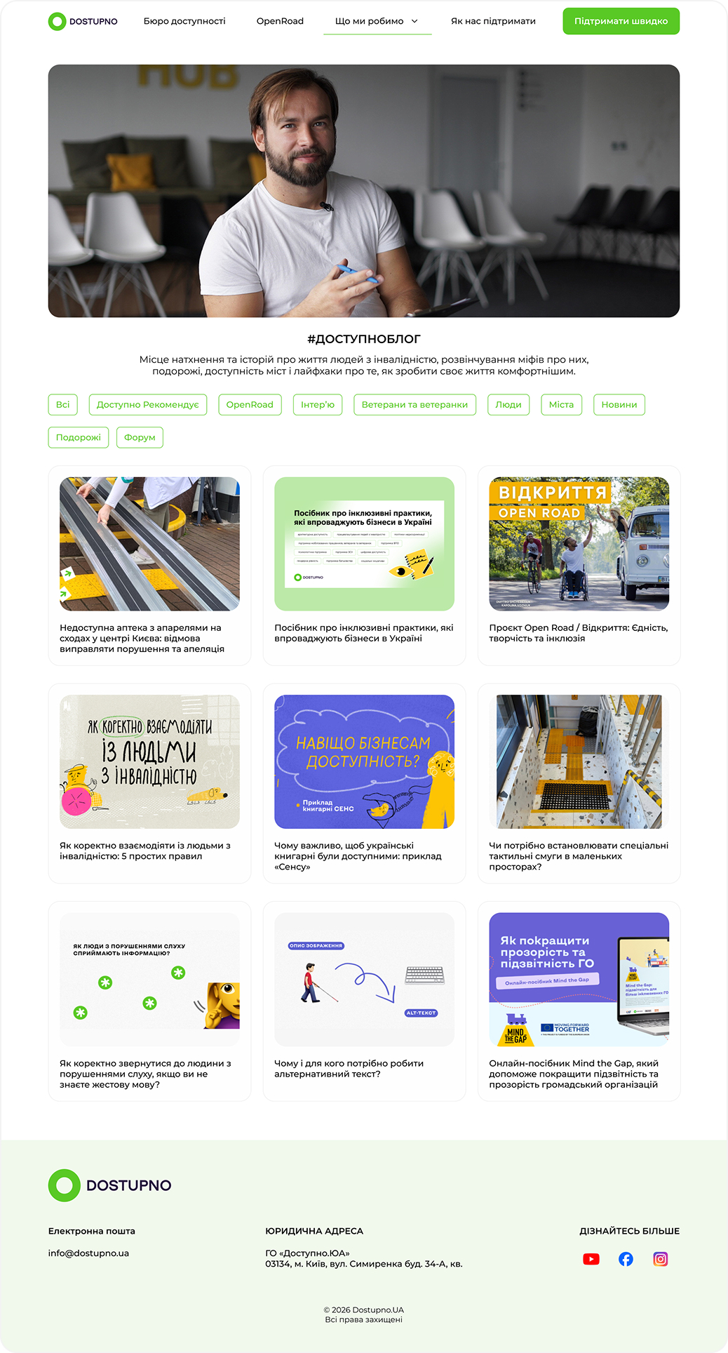
Dostupno Blog
I implemented a clean, flexible grid of content cards (design system components) that maintains visual harmony despite varying image aspect ratios and headline lengths.
Developed entirely on a volunteer basis, this redesign brought together senior-level talent to donate their expertise for social good. As the Senior Product Designer, I led the UX/UI strategy to ensure the organization’s digital tools
are accessible and intuitive.
The design is currently being handed off to developers for a WordPress build, and an additional update for the Open Road
project will follow shortly.